
Style your library: colors and display settings Free & Pro
Restyle a library across every dimension — accent, surface and text colours, style presets, a light/dark scheme, and CSS design tokens — from the Display tab or the block editor.
Updated October 4, 2026
How FileDeck libraries look is controlled on the Display tab under Documents → Settings: default layout, accent color, grid columns, download link styles, empty-state messages, and what titles link to. Set it once and it applies to every library on the site; if you need to go further, all front-end markup uses a stable fdk- class prefix for custom CSS.
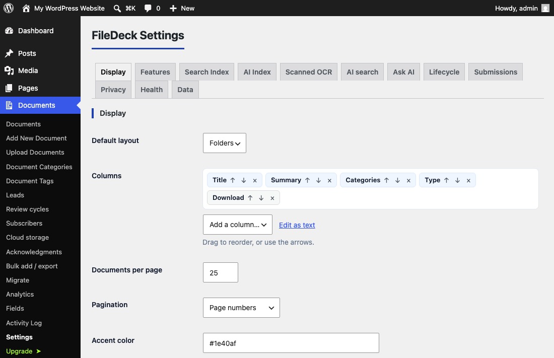
Default layout
Pick Table, Grid, Gallery or Folders as the layout every library uses unless told otherwise. Individual pages can override it with the layout attribute in the block or shortcode.
Accent color
The accent color (default #1e40af) drives the library’s interactive elements — most visibly the download buttons and links. Setting it to your theme’s primary brand color is usually all it takes for FileDeck to look native to your site. FileDeck works with any theme and renders server-side, so the color applies consistently regardless of which theme you run.
Style presets
The Style preset setting re-skins the whole library in one choice:
- Match my theme — inherits your theme’s background, text and accent colours so the library looks native with no CSS. It reads block themes’ global styles, and the palettes published by Astra, Kadence, GeneratePress, OceanWP, Blocksy, Neve, Lightning, Sydney and Elementor; on a theme it doesn’t recognise it falls back to the FileDeck defaults. If an inherited accent would be too faint to read against your page, FileDeck uses your theme’s own text colour instead — and an accent you set yourself takes precedence.
- Minimal — drops the card border and shadow so the rows sit on the bare page.
- Bordered — stronger hairlines and a defined header band.
- Compact — tighter rows and radii for dense libraries.
Presets only re-point colours and spacing, so they combine with the accent, scheme and custom colours. Set one per library with preset="minimal" in the shortcode.
Colour scheme (light and dark)
Colour scheme offers Light (default), Dark, and Auto (follow the visitor’s device). Dark flips every surface, row and hairline to a dark palette while your accent stays your brand colour. Apply it per library with scheme="dark" or scheme="auto".
Surface and text colours
Beyond the accent, you can set the library’s Surface colour (card and control background) and Text colour. Leave them blank to use the theme/scheme default. Tints, hairlines and secondary text derive from these automatically, so a single colour re-skins the whole library consistently. Per library: surface_color="#111827" text_color="#e5e7eb".
Grid columns
For the grid layout, choose Automatic (FileDeck fits cards to the available width) or a fixed count from 1 to 6.
Download link styles
The download link can render as a Button, Button with icon and text, Button with icon only, Icon only, Icon and text link, or Text link. Pick whichever matches your design; the accent color applies to all six, and the icon-only styles keep the download text as their accessible name for screen readers. Column choices themselves are covered in choose and reorder columns.
Empty-state messages
Two messages are editable: what visitors see when a library has no documents ("No documents"), and what they see when a search matches nothing ("No search results"). A friendly, specific message — "No policies here yet, check back in March" — beats the default.
What titles and filenames link to
Choose whether a document’s title links to its document page, triggers a direct download, or is plain text. The filename column has its own setting: plain text or direct download.
What document pages show
Every document has its own page, which lists details such as its reference, dates, categories and tags above the Download button. Document pages on the Display tab chooses which: see document pages.
Going further with custom CSS
If the built-in options do not cover a detail you care about, add your own CSS — for example under Appearance → Customize → Additional CSS. Every element FileDeck outputs uses class names with the fdk- prefix, and that prefix is stable across plugin updates, so custom CSS written against fdk- classes will not break when you update. Use your browser’s inspector to find the class for the element you want to change.
CSS variables (design tokens)
Every colour, surface, border, radius and row density in a FileDeck library reads from a --fdk-* custom property scoped to the .filedeck container. Overriding one variable restyles everything that uses it — including the download buttons — with no specificity battles. The main tokens:
.filedeck {
	--fdk-accent: #1e40af;   /* buttons, links, active states */
	--fdk-ink: #0f172a;      /* primary text */
	--fdk-muted: #64748b;    /* secondary text, meta */
	--fdk-surface: #fff;     /* cards, controls */
	--fdk-surface-2: #f8fafc;/* header row, tints */
	--fdk-border: #e2e8f0;   /* hairlines */
	--fdk-radius: 8px;       /* cards, folders */
	--fdk-radius-sm: 6px;    /* controls, buttons */
	--fdk-radius-lg: 12px;   /* the table card */
	--fdk-row-y: 0.6em;      /* row density */
}
For example, square corners and a slate surface everywhere: .filedeck { --fdk-radius: 0; --fdk-radius-sm: 0; --fdk-radius-lg: 0; --fdk-surface: #f1f5f9; }
If styles are not applying at all, or the library looks broken in your theme, see troubleshooting styling.
FAQ
Can different libraries on one site use different styles?
Display settings are global defaults, but the block and shortcode override them per library — layout, columns, scope, and the styling attributes preset, scheme, accent_color, surface_color and text_color. So one page can run a compact dark table while another shows a card grid in your brand colours. See multiple libraries on one site.
Will my custom CSS survive plugin updates?
Yes, as long as you target the fdk- prefixed classes, which FileDeck keeps stable across updates. Put the CSS in your theme or the Customizer, not in the plugin’s files.
Are the display settings a Pro feature?
No. The Display tab, including the accent color and all four download link styles, is included in the free plugin.
Still stuck? Email support@getfiledeck.com.